How parties shape participation disparities
Interesting changes over time in turnout inequality between socio-economic groups can be seen in the case of the United Kingdom. A popular account explains these changes by using aggregate-level income inequality. I believe a different account is more potent.
Summary
What is the relationship between electoral turnout, economic inequality, and party dynamics? I’ve been focusing on this question both in my doctoral dissertation, as well as in a more recent manuscript. I thought I’d present the central puzzle here, and what I think the answer to it is, using the example of a single context: the United Kingdom.
Here are the key insights:
- There are good reasons to believe economic inequality impacts turnout, with a disproportionately stronger impact on more socio-economically disadvantaged voters
- However, this causal link is based on (1) strong assumptions about voters’ ability to recognize trends in inequality and react to them, and on (2) abstracting away where these macro-economic trends come from and how political actors react to them
- I argue here that it’s more likely political party dynamics are the cause of both economic inequality trends and disparities in turnout
I illustrate this account based on the experience of the United Kingdom between 1966 and 2019, using individual-level turnout self-reports from the British Election Study, and aggregate data about income inequality, union density, and party ideological shifts.
Turnout trends over time
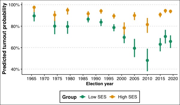
The first aspect to settle is: have there been meaningful changes in turnout in the UK over this period?. I show how this dynamic looks like for 2 separate groups in society, defined based on their socio-economic status (SES): higher-SES (those with at least some college education, and in the top 33% of the income distribution) and lower-SES respondents (those with no high school degree, or lower, and in the bottom 33% of the income distribution in that respective year).
Sub-group electoral trends can’t be divined from aggregate electoral data, so here I use the individual-level self-reported turnout data found in the British Election Study. I compute predicted turnout probabilities based on a standard logistic regression using age, squared age, gender, marital status, education, and income. Through the simulation procedure implemented in the clarify package for R (here), it was easy to obtain predicted probabilities for turnout, together with their associated 95% confidence intervals.
These probabilities are presented in the form of a dot-and-whisker plot in Figure 1. Overlaid on these 2 turnout trends, I also show the dynamic for net income inequality over the same period, as proxied by the Gini index.1 The vertical axis of the figure measures the predicted turnout of the low-SES and high-SES group (depicted in different colors); the gap is the difference between the two groups.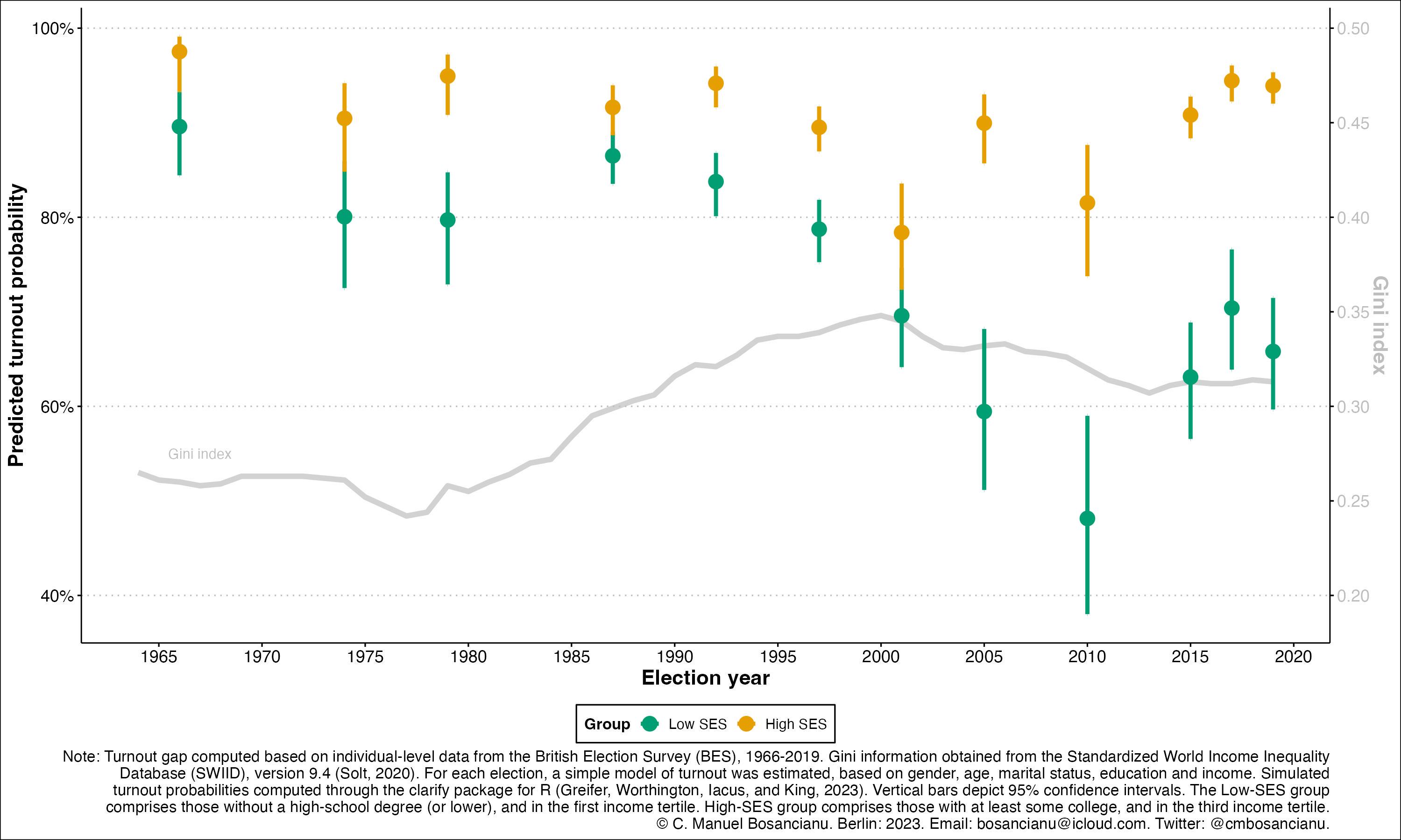
The main takeaway from the figure is that, over the 1985-2010 period, there has been a gradual electoral demobilization of the most socio-economically vulnerable section of the British electorate. Turnout among voters at the lower end of the socio-economic spectrum dropped from around 80-85% in 1985 to about 50% in 2010.2 This is even more surprising when compared to the corresponding trend for higher SES voters, which exhibits trendless fluctuation at around 85-95%.
Explanations
What is the most convincing explanation for why this has happened? A popular argument attributes this to feelings of political inefficacy triggered by economic power imbalances (Solt, 2008). In this account (“relative power”), constantly growing economic inequalities provide cues for lower-SES voters that the political system is mostly unresponsive to their preferences. Irrespective of whether parties of the Left or Right end up in office, the “Matthew principle” continues to operate: those who already have, gain more. This is combined with the expectation that, in this kind of system, those with financial means are more influential when promoting their preferences. In the face of these two dynamics, the rational response is political demobilization on the part of lower-SES citizens.
The trends from Figure 1 above certainly tend to lend support to this account. Starting from the late 1970s we see a sustained growth in income inequality which lasts until the late 1990s.3 With a 10-year delay, which is plausible given the time it takes for such aggregate phenomena to be noticed by voters, this is followed by the demobilization onset I spoke about above.
Other accounts (Radcliff and Davis, 2000) stress the impact of declining levels of unionization. This is also supported by the data (see the bottom third panel in Figure 2 below): the UK went from a union density rate of 50.7% in 1979, to 28.9% in 2001 (data retrieved from the OECD/AIAS ICTWSS database on April 27, 2023). As unions act as powerful agents of working class electoral mobilization, we would expect this trend to be associated with a lower participation rate of lower-SES voters.4
Problems with the relative power account
There are a few challenges to applying the relative power account to the dynamics presented above. The first of which was already hinted at: there is a high degree of collinearity between the union density trend and that for income inequality. Both have been linked with electoral demobilization and, more importantly, with each other (Pontusson, 2013). In these circumstances, it’s difficult to clearly point to economic inequality as the key factor.
Figure 2 below shows this for 8 countries, using data from the OECD/AIAS ICTWSS, and the trends are unmistakable. Take the example of Australia: starting from 1975, union density is on an almost continuous downward trend, while income inequality trends consistently upward. A similar dynamic is visible for the US, the Netherlands starting from 1980, Germany starting from 1990, and, most crucially, the United Kingdom between the late 1970s and 2000.5 Of these 8 countries, only Italy displays a correlation over time between the two trends that is weaker than 0.78, in absolute terms.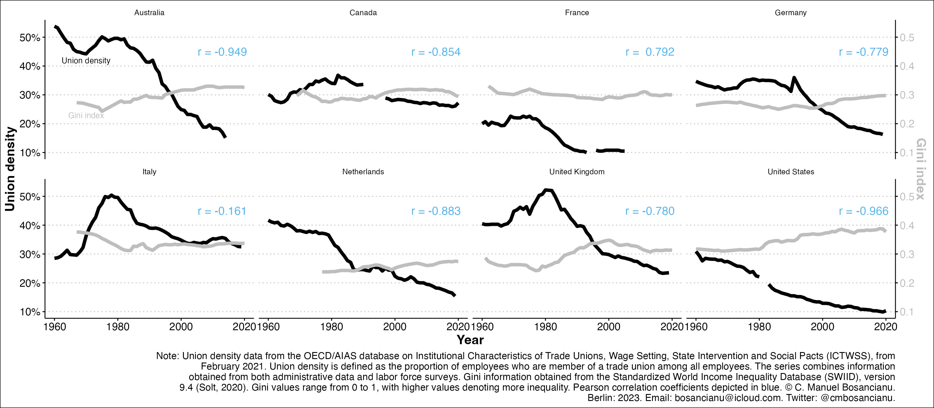
The second difficulty is that most people don’t notice inequality, particularly if it happens at the top (Gimpelson and Treisman, 2018). Even in a period of accelerating inequality, only 42% of Americans believed that economic disparities worsened between 2000 and 2010. On the other hand, 80% of French(wo)men believed inequality had worsened in their country over the same period, even though objectively it had been stagnant (Stiglitz, 2012).
Third, it’s not clear that feelings of discontent are the natural response to rising inequality. As Hirschman and Rothschild (1973) point out, the response to inequality could very well be optimism, as it indicates economic growth. Under the assumption that gains at the top trickle down, more inequality could make lower-SES citizens hopeful that soon their lot will improve as well.
Finally, it is also plausible that the reaction to growing inequality is more mobilization. After all, periods of heightened economic inequality are fertile ground for electoral appeals by Left parties. Under such conditions, appeals to “soak the rich” should find a very receptive audience; if anything, this should increase turnout among more disadvantaged citizens.
If the economic inequality account is tenuous, is there another factor that provides a more consistent story?
Party dynamics over time
I believe that precisely the party dynamics hinted at above hold the key to a more comprehensive answer. The extent to which political parties propose more extreme economic platforms can shape both trends in economic inequality, as well as the willingness of lower-SES voters to vote.
Platform convergence diminishes choice, and increases the difficulty of choosing in terms of information acquisition, which should be more consequential for voters with lower levels of education. At the same time, when parties move away from the ideal policy point of their constituency, electoral abstention (due to alienation or indifference) may ensue, as the policies proposed are either too far away from the voter’s preferences to justify participation, or are too similar to each other, or both (Adams et al., 2006). Party politics also help explain the level of economic inequality in a country, via the policies parties implement once elected into office (Korpi and Palme, 2003).
Figure 3 below presents these dynamics for 2 overarching dimensions, a socio-economic one, and a traditional values one, for the Tories and Labour in the UK. The first dimension refers to issues such as redistribution, deregulation of the economy, nationalization, as well as relationship to unions. The second dimension targets issues such as patriotism, national way of life, importance of law and order, and multiculturalism. In both cases, support or opposition to these policy goals is determined based on statements made in the election manifestos of these respective parties (see here). The figure presents the position of each party for each available election; measurements in the more distant past are presented in a more faded color shade.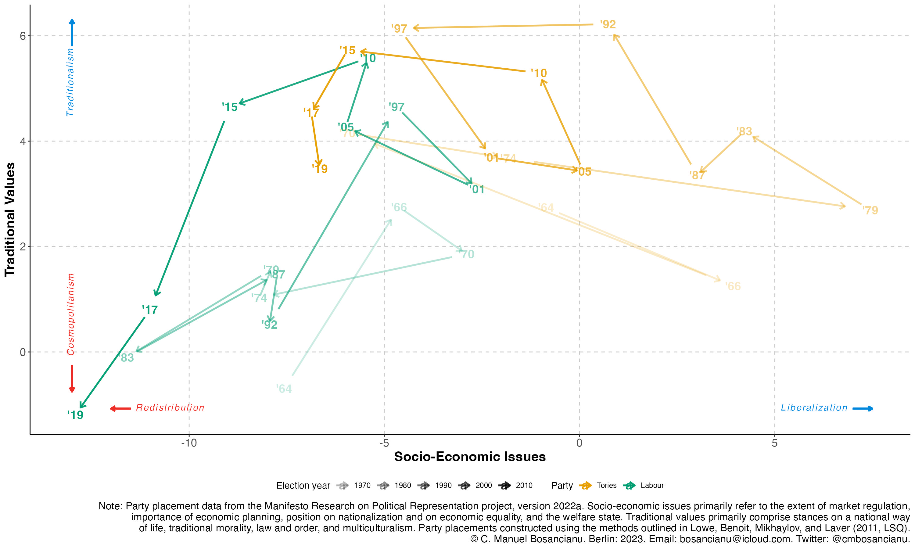
Figure 3 shows that throughout the period when participation rates between lower-SES and higher-SES citizens were roughly comparable, the policy profiles of Labour and Conservatives were relatively distinct. Throughout the 1960s and early 1970s, the two parties occupied distinct policy spaces, with Labour almost consistently more in favor of redistribution than the Tories, and more supportive of cosmopolitanism. This reached its peak in the 1979 and 1983 elections when it came to economic issues, with the two parties at virtually maximum polarization. With the stakes of each election so high, it is perhaps unsurprising that the turnout disparity between the two types of voters was small.
This all changes starting with the 1997 election and right up until the 2015 one, when the two parties essentially occupy the same ideological space, both on the socio-economic axis and the traditional values one. Though the transformation of Labour into New Labour under under Neil Kinnock, John Smith, and Tony Blair is often mentioned as the key causal factor, we can also see a moderation of the Conservative Party. In this latter case, under the stewardship of John Major, the party had to accept that some government programs could not be cut further. Irrespective of the reason, this uncanny similarity of ideological profiles matches very well the sharp decline in participation by lower-SES voters seen in Figure 1. Parties that are so alike in their electoral offer (1) make it hard for voters with limited amounts of political information to distinguish between them, and (2) reduce the incentives such voters have to make an electoral choice. These likely represent 2 strong mechanisms through which the effect responsible for the demobilization seen in Figure 1 is transmitted.
Conclusion
The key takeaway from these inter-connected pieces of evidence is that party politics matter, both for the distribution of income in society and for patterns of participation in the electorate. Though pressures of globalization, technological change and immigration are potent, governments can manage them, as the diverging trajectories in economic inequality between 1980 and 2000 in the UK, Canada, and Netherlands show.
Party choices also matter for the shifting dynamics seen in political participation. Parties’ choices as to which constituency to target with what message impacts voters’ assessment of the utility of participation, and the perceived stakes of the election. In a more direct manner, these choices also alter the costs of participation by supplying the voter with processed political information and voting recommendations. In turn, these factors influence the turnout decision.
“Net income” represents disposable income, after taxes and transfers. Higher values of the Gini index indicate a higher degree of economic inequality. ↩︎
The late 2010s saw a rebound in this group’s aggregate turnout rates, which hovered around 60-65%. ↩︎
If anything, the trend is muted, given that the Gini index is less sensitive to income changes at the tails of the distribution. Using a ratio like P90/P10 would likely result in a more dramatic trend. ↩︎
Although powerful, these mechanisms don’t guarantee that lower-SES citizens will always have lower average participation rates, as the work of Kasara and Suryanarayan (2015) shows. ↩︎
A notable absence from the figure are Scandinavian countries. Similar trends are visible there as well. They are excluded from this display because their extremely high unionization rates would stretch the Y-axis to the point of making trends in other countries barely visible. ↩︎